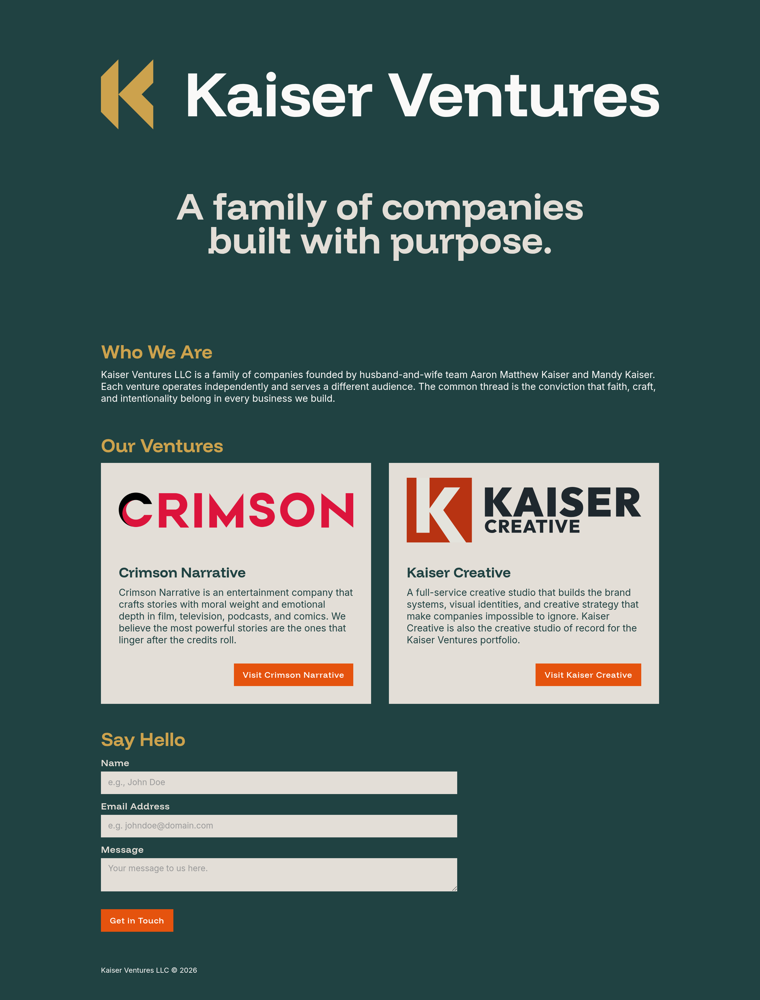
Kaiser Ventures
What this engagement required.
Kaiser Ventures LLC is the holding company behind Kaiser Creative and a growing portfolio of ventures. It is not an operating brand, which made the engagement an interesting challenge: building a brand identity for a company that would rarely be seen, but needed to be right when it was.
The process was an expedited version of the standard Kaiser Creative brand identity engagement. The palette and voice were approached with the same care applied to any client. The difference was in the direction. Where Kaiser Creative is authoritative and provocative, Kaiser Ventures is restrained and personal. The standard is the same. The expression is different.

Color Palette
The palette is drawn from Mindful Palettes No. 201 by Alex Cristache, selected and assigned for the Kaiser Ventures context. Pine Hollow (#204242), a deep earthy near-black with teal undertones, anchors the primary dark environment. Gold is the parent company's signature color, represented by Golden Sheaf (#CCA24D) in dark environments and Burnt Honey (#A87F28) in light environments, shifting between the two values to maintain contrast without losing the gold read. Cloud Petal (#FAF9F8) handles primary text on dark surfaces. Incredible White (#E3DED7) provides surface elevation. Lava Nectar (#E5530E) is reserved for CTAs and occasional accents.
The decision to build the parent company around gold rather than another red variant was structural. Two subsidiaries use red, and a related personal brand uses a third shade of it. Another red at the parent level would dilute all of them. Gold allows Kaiser Ventures to sit above the subsidiary palette family rather than inside it. When someone encounters the gold, then the subsidiary reds, the hierarchy is communicated without words.
Logo
The Kaiser Ventures mark is a geometric K that stands free, without a containing square. The brand's container is implied by everything beneath it, not drawn around it. By contrast, the Kaiser Creative K sits within a defined square boundary. The marks share a visual family resemblance through the K letterform, though the Kaiser Ventures mark was developed independently and is not derived from the same construction. The form also carries a secondary read: the shape suggests movement, like a playhead returning to the start of a timeline. For a family of companies, that read has meaning.
The dark version, the primary environment, places Golden Sheaf (#CCA24D) on the K mark against Pine Hollow (#204242), with the wordmark in Cloud Petal (#FAF9F8). The light version inverts the field to Cloud Petal, shifts the wordmark to Pine Hollow, and moves the mark to Burnt Honey (#A87F28) to preserve the gold read against a lighter background.
Website
The one-page site orients visitors to what Kaiser Ventures is and where its subsidiaries live. The tagline, "A family of companies built with purpose," was chosen deliberately over holding company language for its warmth and accessibility. The about section leads with the founders by name and places faith first in the conviction trio of faith, craft, and intentionality. Each subsidiary card was written to orient and send the reader through, not to replicate the subsidiary's own pitch.
In comparison to Kaiser Creative's brand voice, the Kaiser Ventures voice is more personal and restrained. That distinction required deliberate effort. Kaiser Creative's brand is more established, making it the path of least resistance and the easier voice to default to. Creating something genuinely different meant resisting that pull and building a voice that reflected the parent company's character rather than borrowing from what it holds. Shorter fragments were avoided because they bleed into Kaiser Creative's tone, allowing Kaiser Ventures to speak differently from the brands it holds.
Related Work
The Valley Film Festival
Podcast production, website development, and a 25-year festival database built in Airtable, across a long-term relationship with The Valley Film Festival.
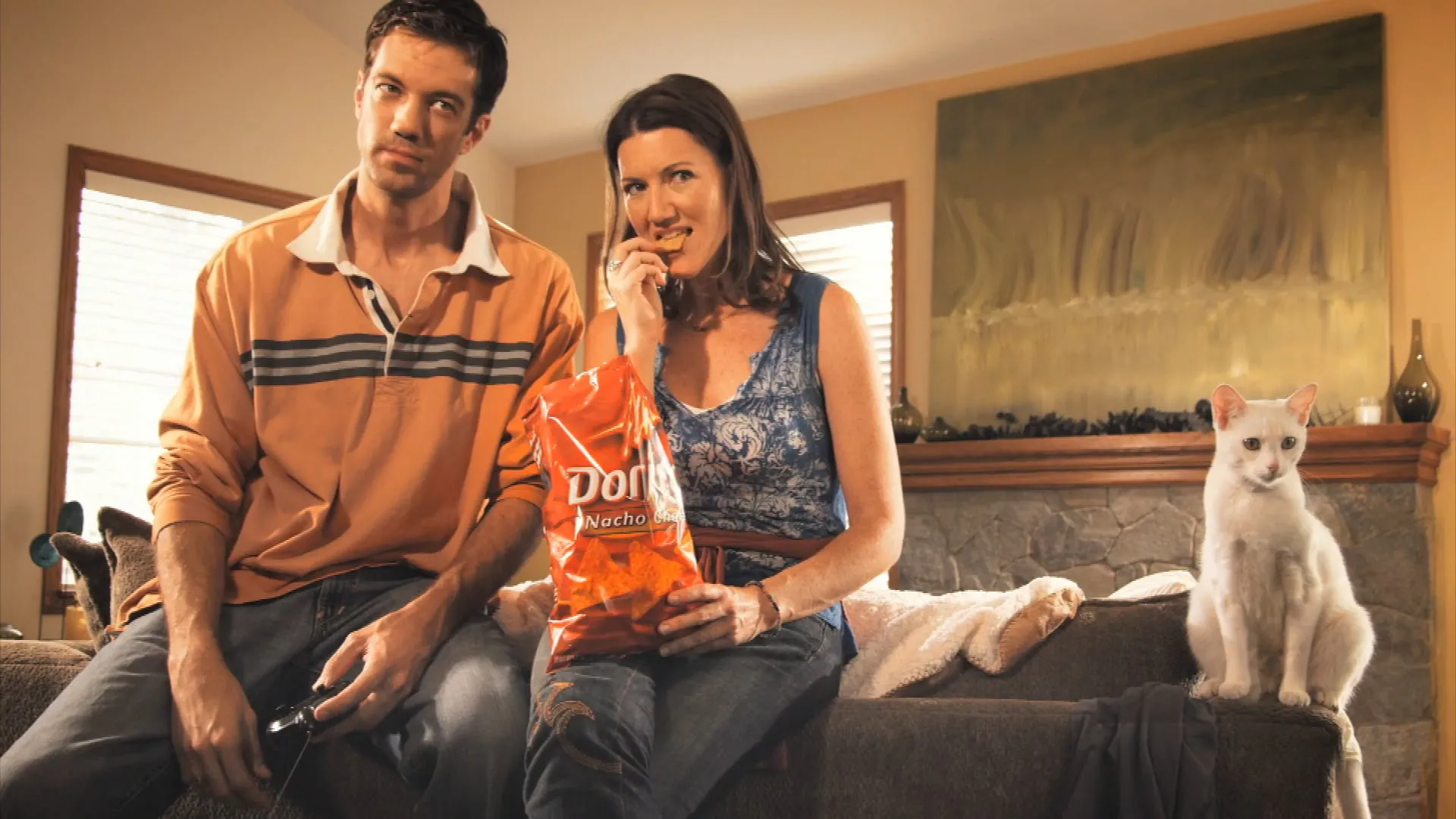
Doritos
Three spec ads for the Doritos Crash the Super Bowl competition. One aired nationally. One went to Cannes.